How we designed the menu for El Bigüá, the restaurant at Hotel Tehuelche
Behind a restaurant's printed menu are decisions that shape how much gets ordered, what gets ordered and how people remember your brand. Here's how we built El Bigüá's autumn 2026 menu.
A menu isn't a list of dishes with prices. It's a brand piece the customer holds in their hands for several minutes, in silence, while deciding how much they're going to spend.
When Hotel Tehuelche asked us to redesign the menu for its restaurant, El Bigüá, we started from that idea: the menu is one of the few brand objects the customer actually touches. It had to live up to it.
The context
El Bigüá is the restaurant at Hotel Tehuelche, in Esquel. Patagonian cuisine, a location with views of Cerro La Hoya, a mixed clientele of hotel guests and local diners. The previous menu was functional but anonymous: generic typefaces, no identity of its own, identical to any chain hotel's.
The brief was clear: a menu that looks the way the restaurant wants to be seen.
The three design decisions
1. The illustration as a brand anchor
The bigüá is a water bird native to Patagonia. Instead of using it decoratively, we turned it into the only graphic element on the cover. A continuous line, no shadows, no fill. An illustration you recognize within two seconds and can reuse later on social media, in the hotel's stationery or as a seal on other materials.
The rule: if a brand piece only works on one medium, it's badly designed. The brand has to travel.
2. The editorial typography
We chose a modern serif for the restaurant's name and a neutral sans for the dishes. That combination isn't aesthetic: it's hierarchy. The serif signals that this is a thought-out place, not improvised. The sans makes the dishes read quickly, effortlessly, in the low light typical of a restaurant at night.
A menu where the customer has to squint to read loses sales. Not because of a bad offering, because of bad reading.
3. The deep blue background
The near-black blue isn't a color decision. It's a context decision. The restaurant has warm, low light. A white background turns aggressive. A cream background gets dirty fast. A deep blue with copper-colored details absorbs the light, makes the gold of the illustration shine, and stays impeccable after several services.
The menu had to survive real use, not just look nice in the approval photo.
What you don't see on the cover
The cover is 10% of the work. The other 90% is the interior grid: how the sections are laid out (starters, mains, desserts), how much space each dish gets, where the prices go.
A few rules we applied:
Prices don't line up in a column. When prices form a vertical column, the customer scans down it and picks the cheapest one. If you place them inline after the description, the customer reads the dish first and the price stays in the background. The difference in average ticket is measurable.
The star dish goes in the upper-right quadrant. That's where the eye lands first when the menu is opened. That spot isn't wasted on a generic starter, it goes to the dish you most want to sell.
No more than seven options per section. Beyond that it saturates. The customer freezes, doesn't decide, and ends up ordering what they already know. Fewer options, a better description of each.
The process
We worked with the hotel's team across three rounds:
-
Brief and references. Together we went through menus from restaurants in Buenos Aires, Bariloche and abroad. Not to copy, to rule out. Defining what we don't want is usually faster than defining what we do.
-
Black and white sketches. A first round with no color. If the composition works in black and white, color only improves it. If it doesn't work, color hides the problem.
-
Final menu with a print proof. Before the final print run we printed on real paper, in the restaurant, under the real light. We caught two things that didn't show up on screen: insufficient contrast in one section and odd spacing in the center area. They were fixed in one morning.
The result
The autumn 2026 menu went into use this week. It's the first in a seasonal series, changing every four months, keeping the identity but rotating dishes according to regional produce.
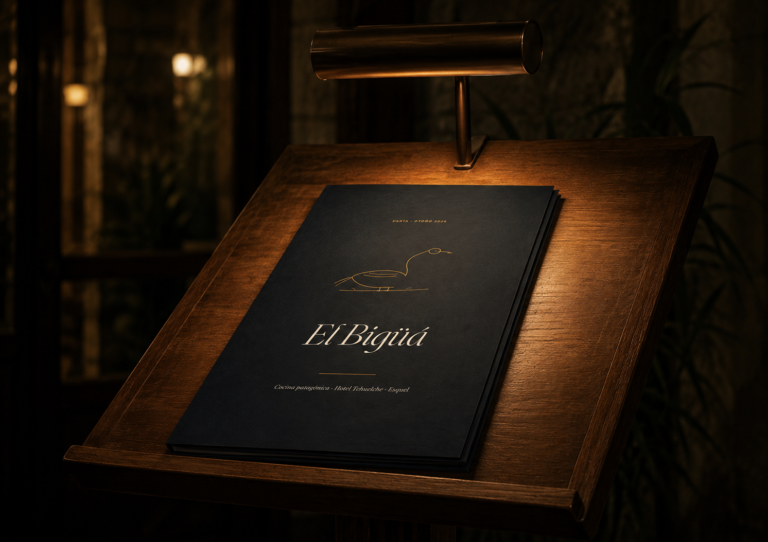
If you have a restaurant, a bar or any business where the menu is a point of contact with the customer, it's worth treating it as what it is: a sales channel. Not an errand for the graphic designer.
Does your restaurant need a menu that lives up to your kitchen? We design visual identities and graphic pieces for hospitality businesses in Argentina.